The new URL is ithinkthatmanwasyou.com/
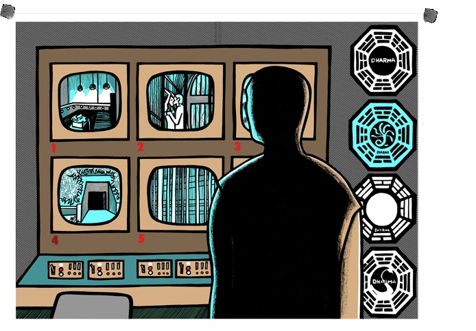
The poster features Jack looking at Kate and Sawyer on the Hydra station monitor. Thanks to Brian for the heads up. The Uni bookstore gave out bookmarks with the URL on. Get on over there and order soon to avoid disappointment.
As far as the poster itself goes... it's a grower for me. I loved number 4, and the art on this one at first just doesn't seem to match - but I'm starting to like it the more I look at it. Let us know what you think.
I quite like that poster really. Instead of drawing a character or a bunch of Lost related things like we have had so far, the artist has drawn his own take on a scene. Shame I can't actually buy them due to a lack of credit card :(
ReplyDeleteI like it as well. I have been able to purchase all of them *except* #4 ::sigh::
ReplyDeleteIt's not bad, but I won't be getting it - I've only bought frame #4 so far, but if I was made of money I'd get them all!
ReplyDeletehow is the quality of the material the pictures are printed on?
ReplyDeleteloved frame 4... this one looks like it was drawn by me!!! with my mouse in paint and using my left hand (im a rightie!!) hahaha... meaning I dont think it goes with the others... its very amateur!
ReplyDeleteit looks alright. the #4 monitor in the poster looks weirdly shaped compared to the rest. And Jack never saw Sawyer and Kate doin' the deed, only the topless cuddling after.
ReplyDeleteA great motif though. And I'm not the best artist in the world, so I won't judge harshly.
you don't need to be a great artist to know if this artist was paid 50 bucks for this poster she was overpaid... 100 gets you 200 if none of these artists are some abc exec's bratty kid.
ReplyDeleteYeah, the more I think about it, this last poster sucks a polar bear's ass. Sorry, but for $50 we should get better.
ReplyDeleteI think the "I think that man was you" bookmarks were much better looking: http://damoncarltonandapolarbear.com/dcpb/x/hub.html
Also, four out of the five posters have used very similar color schemes. I think it's time to mix it up.
I think this is a specific style that some people just don't like.
ReplyDeleteI also think it does that style very well, but whatever.
Exactly what 'style' is this, eh?
ReplyDeleteWould knowing the name of the style make you like it or are you debating that it has a style? Either way, your question does not put you in the greatest light, common sense wise.
ReplyDeleteArt doesn't have to be for everyone. This is my 2nd favourite so far.
ReplyDeleteNEW CLUE!!!
ReplyDeleteFRAME #6
It's a star. Silver.
Something to do with the military?
The star is pretty vague. Could be related to the Dallas Cowboys, for all we know. It does look very Texan.
ReplyDeleteI'm going to make a guess: the next poster is of Kate. That star could be related to a federal Marshal, right? http://en.wikipedia.org/wiki/File:US_Marshal_Badge.png
ReplyDeleteI'm tired of this poster business. Is it "Early 2010" yet?????
ReplyDeleteC'mon, post a frame #6 clue already!! LpstARGs has a post.
ReplyDeleteLostARgs, I mean.
ReplyDeleteLostARGs. Sorry I keep messing up.
ReplyDeletei don't like it at all but then i've never really been fond of graphics of this sort. there seems to be little thought whose communication was really necessary. perhaps i'm to harsh. is this the way the poets see, the' seers'; is this the enchanting and shattering fashion in which those who have been touched by eros feel?
ReplyDelete